
New UM dashboard tracks health data across Montana
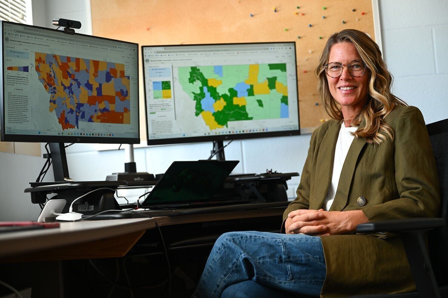
Researchers at the University of Montana created a dashboard to make health data more widely available, with the hope that state policymakers, health officials and other researchers can use it to inform their own work.
A team at the School of Public and Community Health created an interactive online map of the state to visualize anonymized health data, like the number of hospitalizations for cardiovascular diseases or asthma, collected from counties and the state, according to a UM press release on Friday.
Called the Montana Healthy Communities Dashboard, statistician Cindy Leary said this is a valuable tool to assess how susceptible areas are to events like wildfire or high air pollution exposure, and researchers want everyone to have “as much access to information as they possibly can.”
“If people want to be able to explore the impacts of air pollution on health or how social determinants of health are correlated with different health outcomes, that’s our goal in terms of being part of an educational system and giving power to people to be able to ask their own questions,” she said in a statement.
The dashboard, inspired by the California Healthy Places Index, launched on Tuesday.
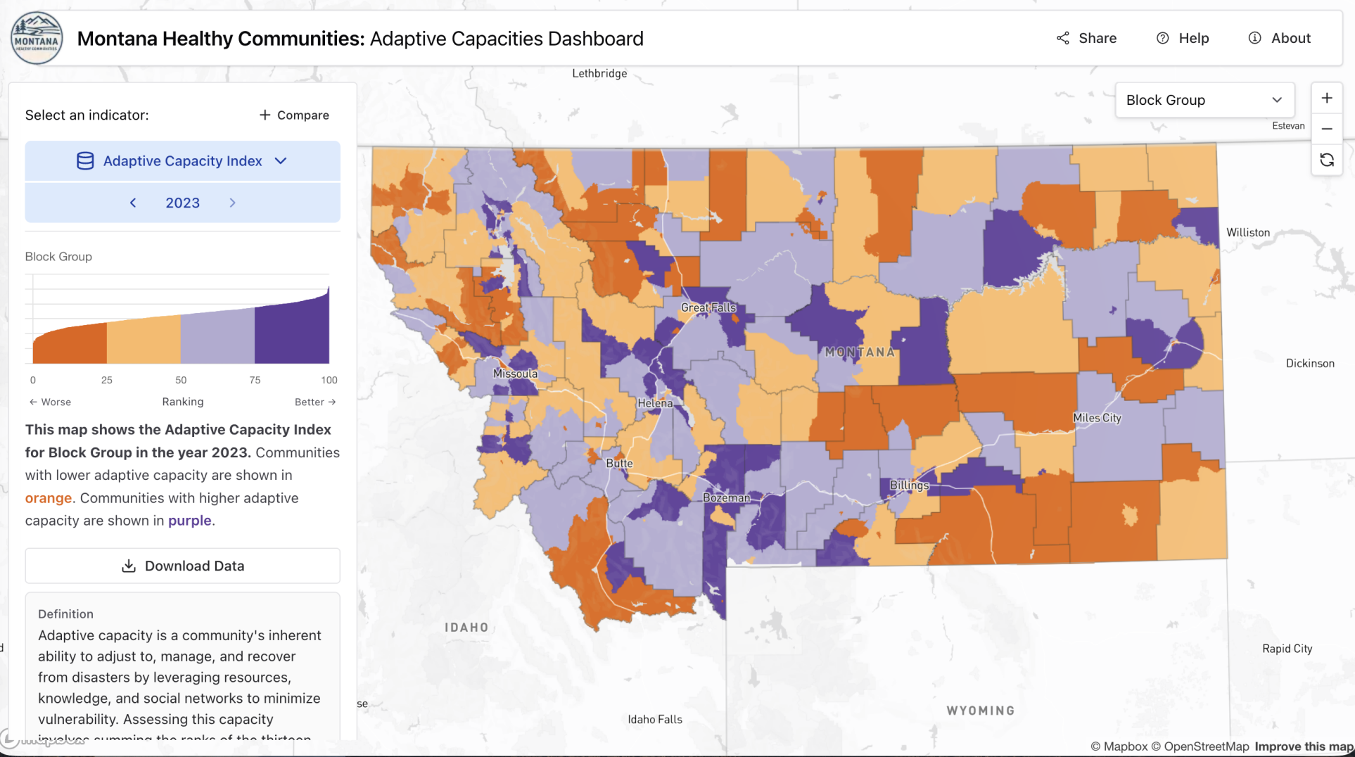
The map color-coordinates different areas of the state for health, social and environmental determinants, like wildfire smoke days, with purple representing more healthy communities and orange less healthy communities. The most recent data as of Friday was from 2023.
Axis Maps created the interactive capabilities and stakeholders helped with UM’s data collection, including Missoula Public Health, Missoula Invest Health, United Way and the Montana Department of Public Health and Human Services.
The dashboard is meant to “break down data silos," according Erin Landguth, director of UM’s Data and Modeling Core of the Center for Population Health Research.
“It brings together environmental exposures like air quality and wildfire smoke, health outcomes like asthma and premature mortality, and socioeconomic resources like income and housing stock — all onto a single, localized map,” she said in a statement.
Health data is typically stored separately from environmental or socioeconomic data, like wildfire smoke or median household income, which can make the process of analyzing potential connections between these factors difficult, the release said.
It also visualizes the community’s ability to recover from public health crises, economic disruptions and natural disasters through what’s called an Adaptive Capacity Index, which analyzes variables in four categories: demographics, housing/transportation, language/education and socioeconomics.
Funding for the project came from Missoula Invest Health and UM’s Center for Population Health Research, which is funded by the National Institutes of Health.
Landguth said in the release that launching the dashboard is not the finish line.
“It’s the starting line,” she added.
“This initial phase gave us the incredible opportunity to build the core structure and data framework with stakeholder feedback,” she said. “Now that the architecture is in place, there are endless avenues for where this can go.”


Comments ()